데브파이브
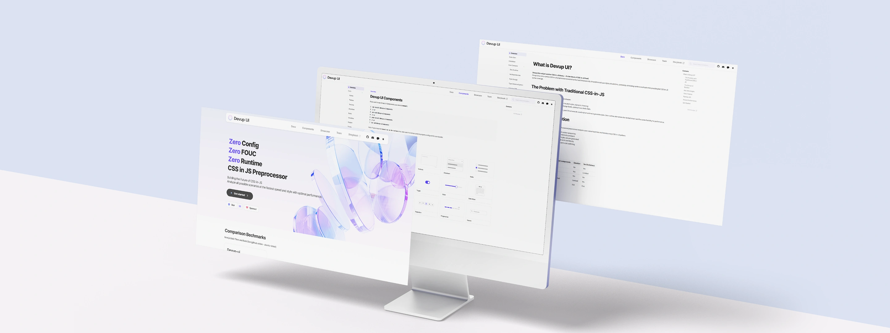
Devup UI Website — Multi-screen Mockup
Logo: Devup UI
네비게이션: Docs · Components · Showcase · Team · Storybook
Screen 1 — Landing (Hero)
- Zero Config
- Zero FOUC
- Zero Runtime
- CSS in JS Preprocessor
- Building the Future of CSS-in-JS
- Analyze all possible scenarios at the fastest speed and style with optimal performance
- Button: Get started >
- Star · Sponsor
섹션: Comparison Benchmarks — Next.js Build Time and Build Size (github action - ubuntu-latest)
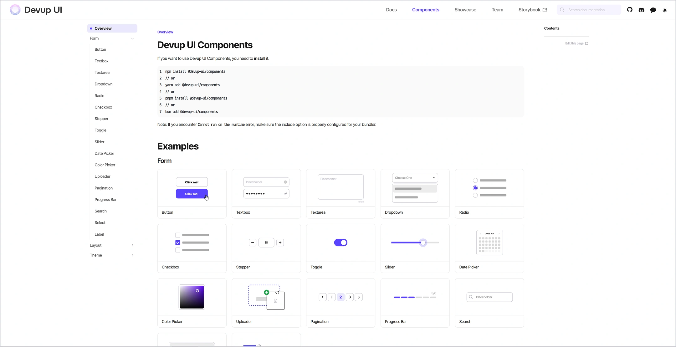
Screen 2 — Components
Title: Devup UI Components
- Pull, install (Drop UI Components) — Example installation code
- 컴포넌트 갤러리: Button, Checkbox, Dropdown, Radio, Toggle, Slider, DatePicker, Pagination, ProgressBar, Switch 등
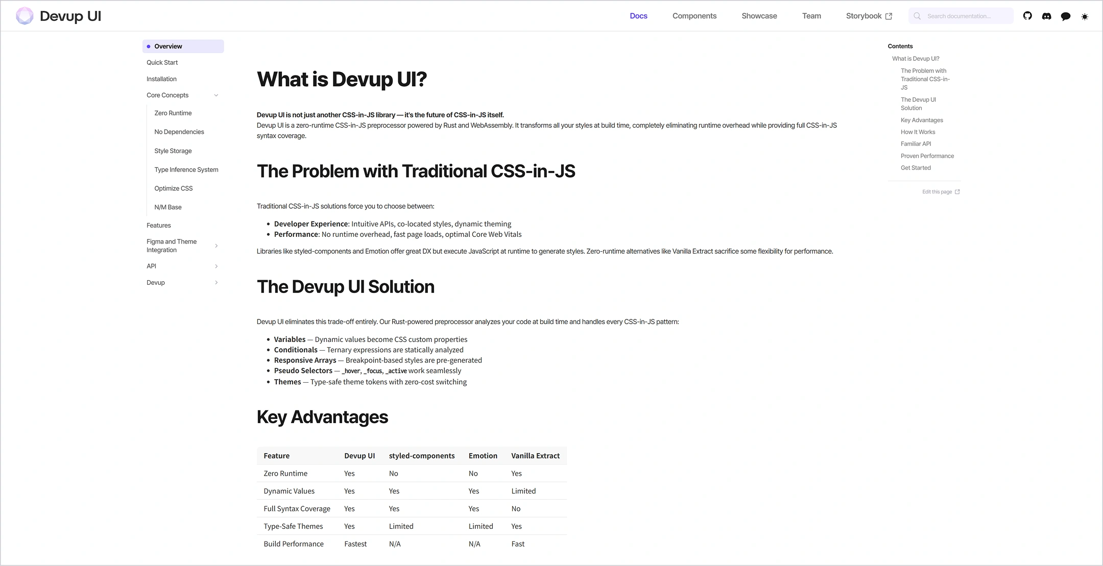
화면 3 — Docs (What is Devup UI?)
- What is Devup UI?
- Devup UI is output another CSS-in-JS library — It's the future of CSS-in-JS itself.
- The Problem with Traditional CSS-in-JS
- (본문: located styles, dynamic theming, large loads, optional Core Web Vitals 등)
- 비교 표: Devup UI · Other components · Emotion · Vanilla Extract
Devup UI

This project developed Devup UI, DevFive’s in-house frontend UI component library, designed to improve developer productivity while enabling consistent, high-quality design implementation across products.


All components adopt a modern styling approach based on CSS-in-JS, providing strong extensibility so developers can flexibly customize UI to match each project’s requirements. The library was built to support efficient design-system integration across internal teams and to accelerate rapid prototyping workflows.


In addition, Devup UI establishes a reusable component framework intended to be used as a core foundation across DevFive’s web and app projects. Its architecture is designed to remain flexible and scalable for external collaborations as well, allowing smooth adoption and extension in partner projects—ultimately serving as a strategic engineering asset that strengthens DevFive’s overall development capability and project efficiency.

md

코드 복사


Production Period2025. 01 - In Progress
ClientDevFive
TechnologiesRust
Service
Preview
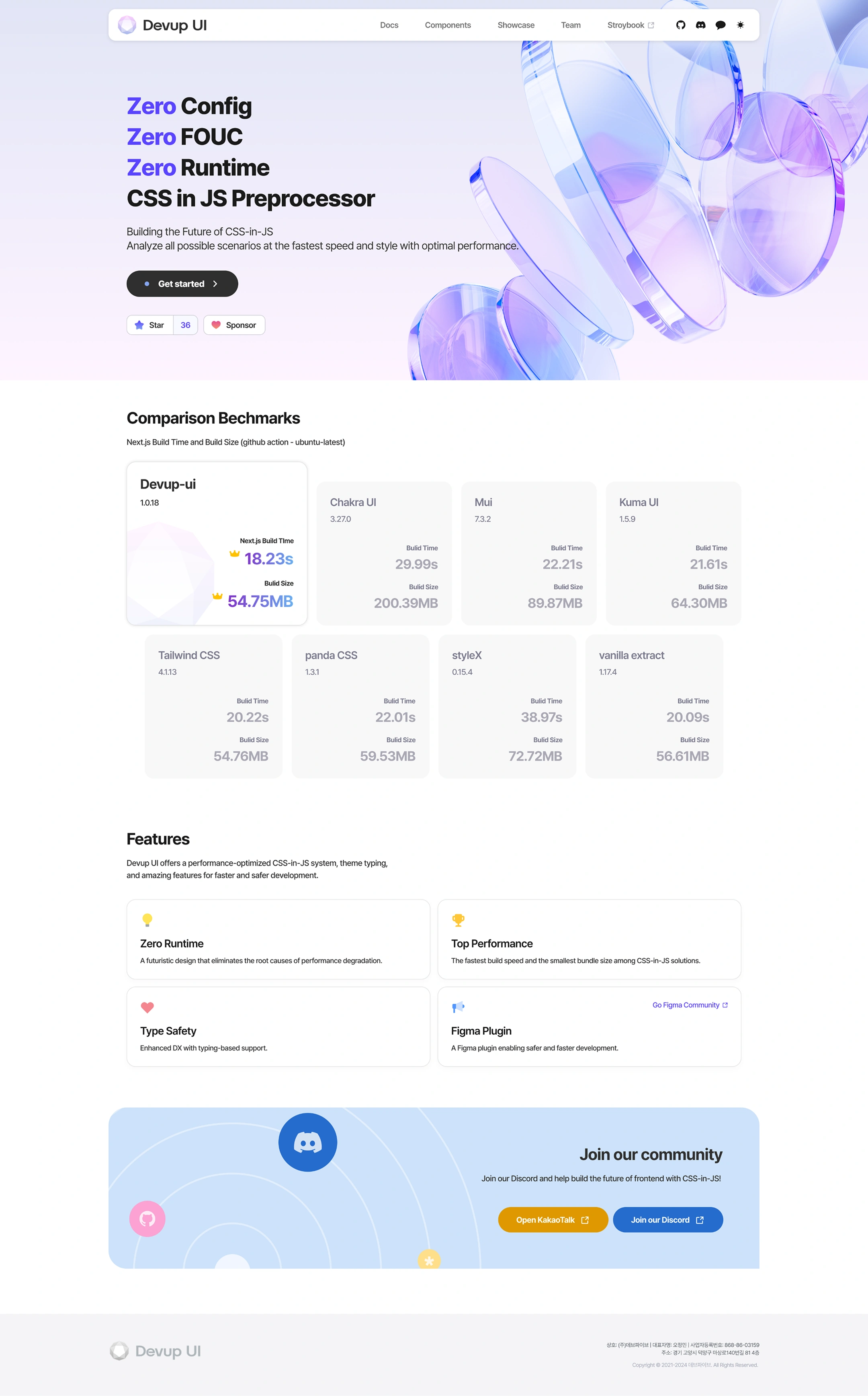
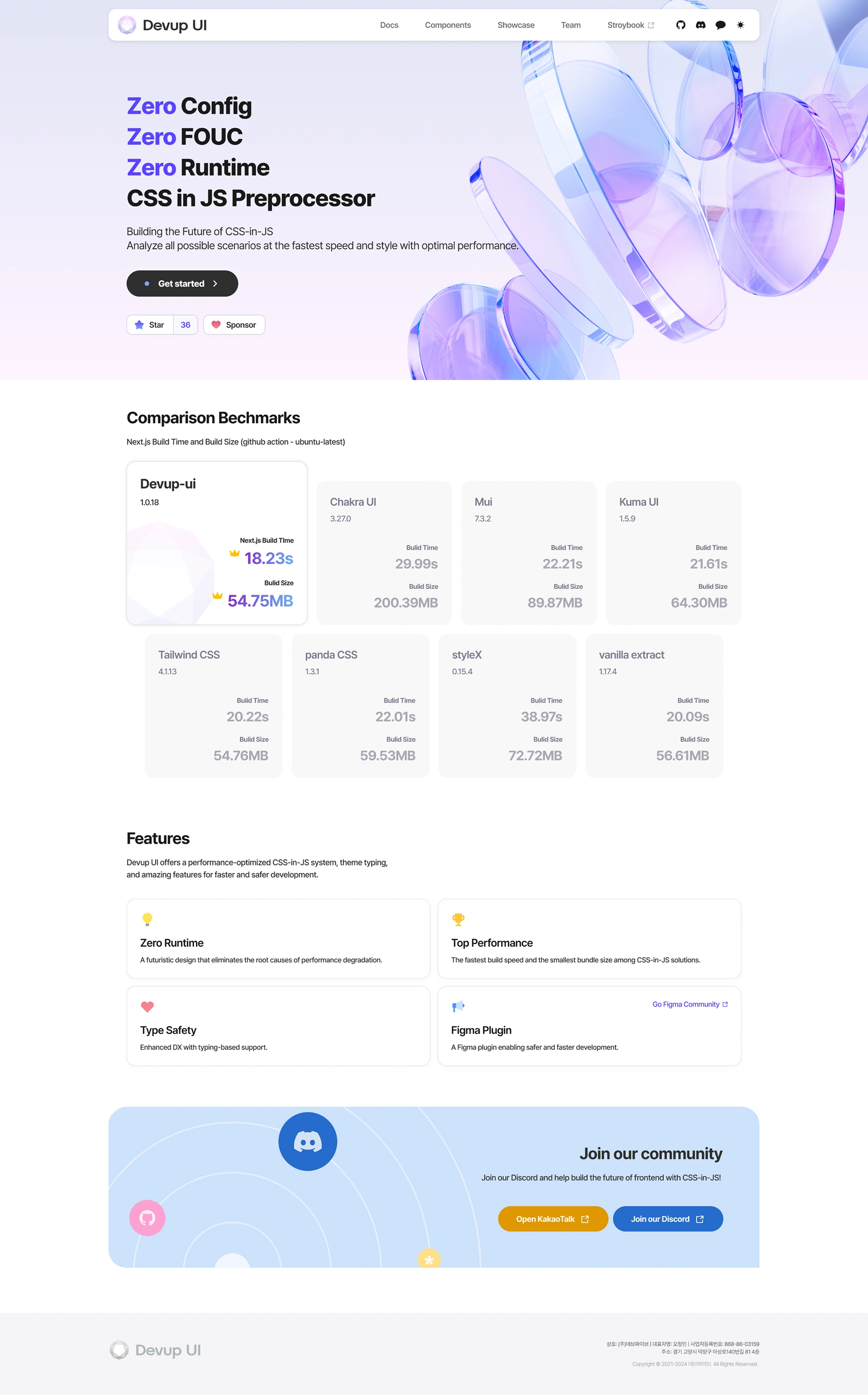
Devup UI Landing Page — Full
Logo: Devup UI
Navigation: Docs · Components · Showcase · Team · Storybook · GitHub · Discord · Chatting · Dark Mode toggle
Hero
- Zero Config
- Zero FOUC
- Zero Runtime
- CSS in JS Preprocessor
- Building the Future of CSS-in-JS
- Analyze all possible scenarios at the fastest speed and style with optimal performance.
- Button: Get started >
- Star 36 · Sponsor
Comparison Benchmarks
Next.js Build Time and Build Size (github action - ubuntu-latest)
Library Version Build Time
Devup-ui	1.0.18	👑 18.23s
Chakra UI	3.27.0	29.99s
Mui	7.3.2	22.21s
Kuma UI	1.5.9	21.61s
Tailwind CSS	4.1.13	20.22s
panda CSS	1.3.1	22.01s
styleX	0.15.4	38.97s
vanilla extract	1.17.4	20.09s
Features
Devup UI offers a performance-optimized CSS-in-JS system, theme typing, and amazing features for faster and safer development.
Feature Description
Zero Runtime	A futuristic design that eliminates the root causes of performance degradation.
Top Performance	The fastest build speed and the smallest bundle size among CSS-in-JS solutions.
Type Safety	Enhanced DX with typing-based support.
Figma Plugin	A Figma plugin enabling safer and faster development. (Go Figma Community)
Join our community
- Join our Discord and help build the future of frontend with CSS-in-JS!
- 버튼: Open KakaoTalk · Join our Discord
Footer
- Devup UI
- Trade name: Dev Five | Representative name: Oh Jung-min | Business registration number: 868-86-03159
- Address: 814th floor, Masang-ro 140beon-gil, Deokyang-gu, Goyang-si, Gyeonggi-do
- Copyright © 2021-2024 Dev Five. All Rights Reserved.
Hover over the screen!
Client Requirements
& Project Direction
Through client interviews and consultations we derived the project's core requirements, and based on those insights we designed it around five areas that needed improvement from user experience and brand perspectives.
1.
Build a component-based UI system that secures code consistency and reusability
2.
Maintain design consistency with a component structure backed by a style guide
3.
Implement a documentation system providing installation guides and example code per component
4.
Provide a Discord-based community channel for feedback and improvement requests
5.
Strengthen usability by improving development efficiency and shortening the learning curve
Typography
& Color System
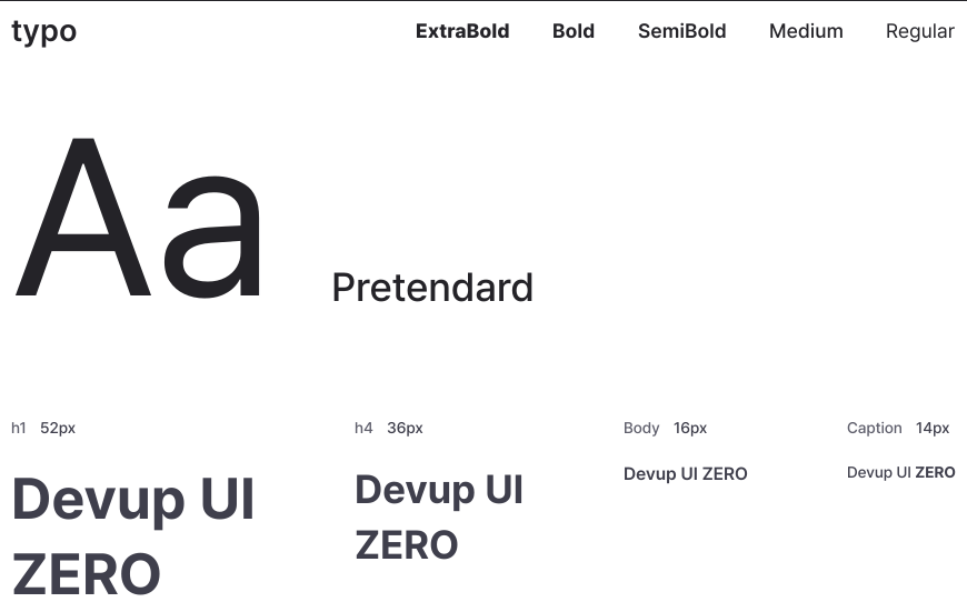
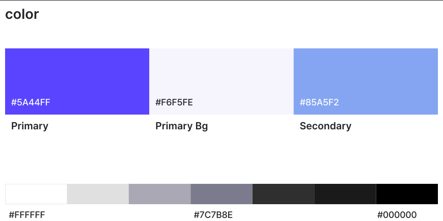
We established a systematic color system with brightness contrast that considers users' visual comfort, and designed easily extensible typography and shared components to deliver a consistent brand experience.Section: typo
Font: Pretendard
Weight scale: ExtraBold | Bold | SemiBold | Medium | Regular
Sample: Aa
typography scale
Style Size Sample Text
h1	52px	Devup UI ZERO
h4	36px	Devup UI ZERO
Body	16px	Devup UI ZERO
Caption	14px	Devup UI ZEROSection: color
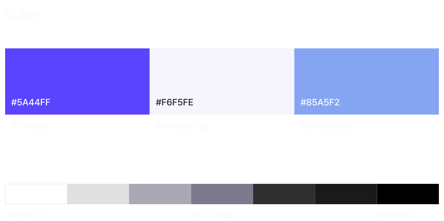
Main color
Categorized HEX Color
Primary #5A44FF Purple
Primary Bg #F6F5FE Light Lavender
Secondary #85A5F2 Light Blue
Grayscale (Step 7)
Step HEX
1	#FFFFFF
2	·
3	·
4	#7C7B8E
5	·
6	·
7	#000000Section: typo
Font: Pretendard
Weight scale: ExtraBold | Bold | SemiBold | Medium | Regular
Sample: Aa
typography scale
Style Size Sample Text
h1	52px	Devup UI ZERO
h4	36px	Devup UI ZERO
Body	16px	Devup UI ZERO
Caption	14px	Devup UI ZEROSection: color
Main color
Categorized HEX Color
Primary #5A44FF Purple
Primary Bg #F6F5FE Light Lavender
Secondary #85A5F2 Light Blue
Grayscale (Step 7)
Step HEX
1	#FFFFFF
2	·
3	·
4	#7C7B8E
5	·
6	·
7	#000000
Typography
& Color System
We established a systematic color system with brightness contrast that considers users' visual comfort, and designed easily extensible typography and shared components to deliver a consistent brand experience.Section: typo
Font: Pretendard
Weight scale: ExtraBold | Bold | SemiBold | Medium | Regular
Sample: Aa
typography scale
Style Size Sample Text
h1	52px	Devup UI ZERO
h4	36px	Devup UI ZERO
Body	16px	Devup UI ZERO
Caption	14px	Devup UI ZEROSection: color
Main color
Categorized HEX Color
Primary #5A44FF Purple
Primary Bg #F6F5FE Light Lavender
Secondary #85A5F2 Light Blue
Grayscale (Step 7)
Step HEX
1	#FFFFFF
2	·
3	·
4	#7C7B8E
5	·
6	·
7	#000000Section: typo
Font: Pretendard
Weight scale: ExtraBold | Bold | SemiBold | Medium | Regular
Sample: Aa
typography scale
Style Size Sample Text
h1	52px	Devup UI ZERO
h4	36px	Devup UI ZERO
Body	16px	Devup UI ZERO
Caption	14px	Devup UI ZEROSection: color
Main color
Categorized HEX Color
Primary #5A44FF Purple
Primary Bg #F6F5FE Light Lavender
Secondary #85A5F2 Light Blue
Grayscale (Step 7)
Step HEX
1	#FFFFFF
2	·
3	·
4	#7C7B8E
5	·
6	·
7	#000000

Take the for your business,

All you need is an idea. From the first consultation to launch, DevFive is by your side.
Contact Us Now
Quick Inquiry